PROJECTS
しばみつ®Shiba-Mitsu®
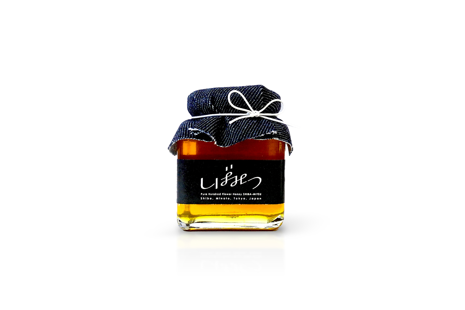
都市の百花蜜
ミツバチの描く軌跡の様で、そしてどこか異国の文字を手で書いた様で、足を止めてみると「しばみつ」というひらがなが浮かんでくる。
・滑らかで丸みを帯びたデザインで親しみやすさを感じさせる
・「し」と「つ」、「ば」と「み」に共通の要素を用いることで、港区らしい「着飾らないけどおしゃれ」を表現
・「み」は港区章をアレンジした字体
※しばみつ®は港区の商標登録(第6281489号)です。
※パッケージ全体のデザインについては芝地区総合支所および芝BeeBee’sと協働して決定しています。
クライアント:港区
完成:2019年8月
状況:完成
Urban Honey, Hundred Flower Honey
Although it looks like the path of a honeybee or the hand-drawn letters of a foreign language, once you stop to look at it, the Japanese hiragana characters will stand out to spell "Shibamitsu"(しばみつ).
・The smooth and rounded design has a familiar feel.
・The common elements of the characters "shi"(し), "tsu"(つ), "ba"(ば) and "mi"(み) are used to express a fashionable while not fancy look becoming of Minato Ward.
・The font used for the character "mi"(み) channels the symbol of Minato Ward.
Client: Minato-ku
Year: 2019
Type: Other
Location: Minato-ku, Tokyo, Japan
Status: Completed


